News & Updates Antiquarian Booksellers' Association of America Philip Salmon & Company Rare Books
Celebrating Beatrice Warde

By Books@Bromer
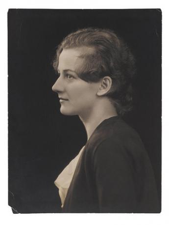
After a short hiatus, we're back on the occasion of typographical scholar Beatrice Warde's birthday. Born on September 20th, 1900, Warde lived during a renaissance in American and British graphic design and was a woman who made a name for herself in the then predominately male world of typography.
Warde had an interest in calligraphy and letterforms from a young age, and she was able to nurture and expand this interest after she became assistant librarian at the American Type Founders Company in 1921. Her position allowed her to spend time researching typefaces and printing history, a pursuit which led to the publication of "The Garamond Types, Sixteenth and Seventeenth Century Sources Considered," an article Warde wrote and published in The Fleuron under the pseudonym Paul Beaujon in 1926. This article cemented Warde's influence as a scholar of typography by tracing the origins of Garamond types and finding that certain types initially attributed to Garamond were, in fact, cut by Jean Jannon.
The previous year, Warde had married typographer Frederic Warde, and the couple had moved to London, where Warde worked at The Fleuron under the editorship of Stanley Morison. When her pseudonymous article appeared, Warde, as Paul Beaujon, was offered the post of editor of the Monotype Recorder, an important source of publicity for the Langston Monotype Corporation. She accepted the position, revealing herself to be a woman and earning a place as one of the few women working in the field of typography at the time. A few years later, Warde was promoted to the post of publicity manager and remained there until her retirement in 1960.
While at Monotype Corporation, Warde worked with many famous type designers, including Stanley Morison, who was the typographic adviser, and Eric Gill, whose Gill Sans and Perpetua types were produced by Monotype. It was through the confluence of these two men's influence that Warde's perhaps most far-reaching contribution was born.
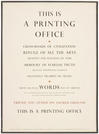
Warde's "This is a Printing Office" broadside, designed to showcase Gill's Perpetua titling capitals, was published in 1932. It was one of many broadsides Monotype produced, at Morison's suggestion, to display their type designs. However, this particular broadside carried a singular message, that the printed word is essential in the preservation of a free society. Here are her words in their entirety:
This is a
Printing Office
Crossroads of Civilization
Refuge of all the arts
against the ravages of time
Armoury of fearless truth
against whispering rumour
Incessant trumpet of trade
From this place words may fly abroad
Not to perish on waves of sound
Not to vary with the writer's hand
But fixed in time having been verified in proof
Friend, you stand on sacred ground
This is a Printing Office
The broadside resonated with many, so much so that the words were cast in bronze and now stand at the entrance to the United States Government Printing Office. They were also translated into many languages and grace the walls of printing shops around the world.
Warde continued to advocate for and teach young type designers about the benefits of the classical forms of typography until her death in 1969. In particular, she espoused type design that disappeared behind the ideas it was conveying, stating in her essay "The Crystal Goblet" that "Type well used is invisible as type." This coincides with her characterization of the printing office as the "crossroads of civilization." Printing and typography were meant to be utilitarian, the means to bring brilliance from the mind to the world.
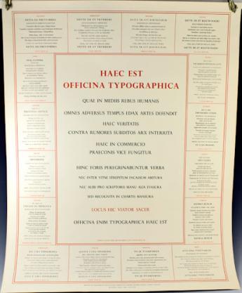
Around 1978, Monotype reissued Warde's iconic broadside in a way that better exemplifies its meaning and impact in the world. The broadside presents Warde's powerful message in Latin and sixteen other Western languages, from English and Icelandic to Turkish and Croatian. It measures approximately 24 3/4 by 19 3/4 inches and is printed in seventeen different types. It is a fitting tribute to Beatrice Warde, who dedicated her life to the transmission of ideas through typography.
Around 1978, Monotype reissued Warde's iconic broadside in a way that better exemplifies its meaning and impact in the world. The broadside presents Warde's powerful message in Latin and sixteen other Western languages, from English and Icelandic to Turkish and Croatian. It measures approximately 24 3/4 by 19 3/4 inches and is printed in seventeen different types. It is a fitting tribute to Beatrice Warde, who dedicated her life to the transmission of ideas through typography.
For more on Beatrice Warde, see below:
>>> Princeton University Library Graphic Arts Collection's Unseen Hands exhibit
>>> University of North Texas College of Visual Arts and Design Communication Design Blog
>>> For more on Monotype's reissued broadside, visit our website.
***
Are you collecting the works of Beatrice Warde?
>>> Browse the ILAB Metasearch
Posted on Books@Bromer. The article is presented here by permission of the author. Pictures: https://www.flickr.com/photos/eyemagazine/8201964995/, http://www.pinterest.com/pin/256071928783317041/, via Bromer Booksellers.


