Tip
The Picasso of Dust Jacket Design

By Stephen J. Gertz
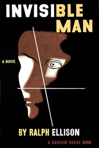
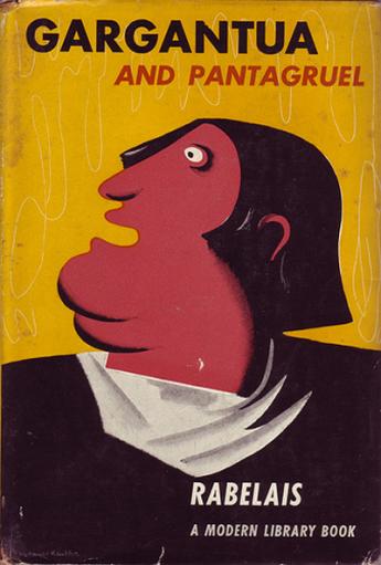
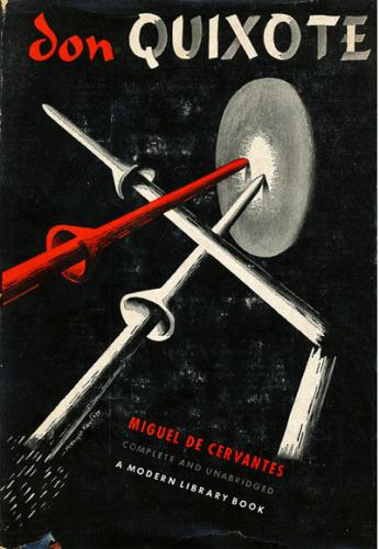
He brought poster, advertising, and dust jacket design out of the nineteenth century and into the twentieth, integrating the aesthetic and forms of modern art into his work. It was welcomed in England. It was rejected in the United States. In his time he was, ultimately, the most significant graphic designer in the English-speaking world.
Born in Montana, USA, E[dward]. (“Ted”) McKnight Kauffer (1890-1954) was one of Europe's most prolific and influential advertising poster artists during the 1920s and 1930s, and as innovative as his French counterpart, A.M. Cassandre. His dust jacket designs are no less celebrated. At a time when marketers preferred simple, representational designs heavy with copy, he took another direction. His dust jackets are highly coveted by rare book collectors.
This "American designer and painter...was active in England...studied painting first, at evening classes at the Mark Hopkins Institute, San Francisco (1910–12), at the Art Institute of Chicago, with lettering (1912), and in Paris at the Académie Moderne (1913–14). In 1912 he adopted the name of an early patron, Professor Joseph McKnight (1865–1942), as a gesture of gratitude. In 1914 he settled in Britain.
"From 1915 McKnight Kauffer designed posters for companies such as London Underground Railways (1915–40), Shell UK Ltd, the Daily Herald and British Petroleum (1934–6). One of his master works, Soaring to Success! Daily Herald - The Early Bird (1919), was derived from Japanese prints and from Vorticism. In 1920 he was a founder-member of Group X with Wyndham Lewis and others. McKnight Kauffer’s designs included illustrations for T. S. Eliot’s Ariel Poems [London, 1927–31, printed by the Curwen Press] and for publications by the Nonesuch Press and Cresset Press, using the pochoir process of coloured hand-stenciling; he also designed photomurals, ephemera such as luggage labels; and theatre and ballet costumes and sets, including Checkmate (1937)...
"He made skillful use of the airbrush and the montage technique, often applying his knowledge of modern art movements such as Constructivism and Surrealism. In 1940 he went to New York, where he designed posters for war relief agencies, the United Nations and American Airlines (1946–53), as well as many book jackets and illustrations" (Mark Haworth-Booth, Grove Art Online, 2009).
He struggled in New York. It was a highly competitive environment for commercial artists and advertisers were not as open to his work as they were in Britain.
In a review of one of his frequent exhibitions during the Thirties, Kauffer was referred to as the “Picasso of Advertising Design...Mr. McKnight Kauffer is an artist who makes one resent the division of the arts into major and minor" (Anthony Blunt).
From 1928 through the early 1950s, Kauffer designed thirty-one dust jackets for the Modern Library, including: Sherwood Anderson's Winesburg Ohio; Edward Bellamy's Looking Backward; Arnold Bennett's The Old Wive's Tale; Boccaccio's Decameron; Samuel Butler's The Way of All Flesh; Cervantes' Don Quixote; Clausewitz's On War; Du Maurier's Rebecca; Falkner's Sanctuary, Light in August, and Go Down, Moses; Theophile Gautier's Mademoiselle de Maupin; Hammett's The Maltese Falcon; Hemingway's The Sun Also Rises; W.H. Hudson's Green Mansions; Huxley's Point Counter Point; Henry James' Portrait of a Lady; D,H. Lawrence's Women in Love; Maurois' Disraeli; Moby Dick; Palgrave's Golden Treasury; The Best of S.J. Perelman; Rabelais; Spaeth's Guide to Great Orchestral Music; Dracula; Sterne's Tristam Shandy and A Sentimental Journey; Arthur Symonds' Life of Michaelangelo; Thackeray's Henry Esmond; Richard Wright's Native Son; and Young's The Medici.
"In Kauffer's hands the poster (or the book jacket, which for him was a mini-poster) was designed to be interpreted rather than accepted at face value. In this regard he continually struggled with the paradox of how to meet his creative needs, his clients' commercial interests and his viewers' aesthetic preferences, all in a limited period of time. In a speech before the Royal Society of Arts in 1938 ...Kauffer candidly explained his methodology and resultant angst.
"'When I leave my client's office, I am no longer considering what form my design or my scheme will take, but the urgent fact that I only have so much time in which to produce the finished article. I find this irritating, and am often overcome by a feeling of hopelessness about the whole business. On my way home I think, Will my client understand what I propose to do? Will he understand I may not give him an obvious, logical answer to his problem? Does he suppose I have magical powers, or does he believe that I can solve his sales problem as simply as one might add two and two together and make four?
"'I have now reached my studio. I pick up a book. I lay it down. I look out of the window. I stare at a blank wall, I move about. I go to my desk and gaze at a blank piece of paper. I write on it the names of the product. I then paint it in some kind of lettering. I make it larger—smaller—slanting—heavy—light. I make drawings of the object—in outline, with shadow and color, large and then small—within the dimensions I have now set myself''" (Citation,American Institute of Graphic Arts Medal, 1992).
“Most advertising artists spend their time elaborating symbols that stand for something different from the commodity they are advertising. Soap and refrigerators, scent and automobiles, stockings, holiday resorts, sanitary plumbing are advertised by means of representations of young females disporting themselves in opulent surroundings. Sex and money—these would seem to be the two main interests of civilized human beings.
"McKnight Kauffer prefers the more difficult task of advertising products in terms of forms that are symbolic only of these particular products. Thus, forms symbolic of mechanical power are used to advertise powerful machines; forms symbolic of space, loneliness and distance to advertise a holiday resort where prospects are wide and houses are few. In this matter McKnight Kauffer reveals his affinity with all artists who have ever aimed at expressiveness through simplification, distortion and transportation (Aldous Huxley, Introduction to Posters by E. McKnight Kauffer, Museum of Modern Art exhibition catalog, 1937).
Kauffer's difficulties in New York continued through 1947. It was then that he began to design posters for American Airlines, his biggest client until his death in 1954, and the work that finally brought him the commercial success in the U.S. he so desired.
Kauffer has always been highly collectible. His visually arresting and compelling designs remain as fresh and dynamic as when originally executed.
The article is published (with much more pictures) in Booktryst. It is presented here by permission of the author.


