Antiquarian Booksellers' Association of America Oak Knoll Books
The Aldine Italic
By Daniel Berkeley Updike
From our survey of fifteenth century types it would appear that every country had its formal pointed black-letter; every country, save England, its classical roman type; and every country - except, perhaps, Spain - its cursive vernacular black-letter type, copied from the handwriting of the locality and time. Before 1500 Italy had no vernacular type simply because the current handwriting of Italy (which was not of the black-letter school) was only translated into type-forms at the beginning of the sixteenth century. Italic was the Italian cursive vernacular type, and it ultimately drove out all other vernacular types wherever roman letters came into general use. It was produced by Aldus in 1501; but it was modelled so clearly on fifteenth century cursive hands, that it comes within the range of fifteenth century fonts. So to complete our review of the earliest type-forms, we must consider this famous italic.
We cannot understand the work of Aldus Manutius and the Aldine printing-office, or the innovation made by books in small format printed in italic type, unless we know something of the intellectual condition of Europe at the time of Aldus, and about an experiment which he made in type-cutting some years earlier. “In 1500, men were thinking of new things,” says Pollard. “New editions of many of the old religious and didactic treatises, the old poems and romances, continued to be printed, though mostly in a form which suggests that they were intended for a lower class of readers; but the new publishers would have little to do with them. Scholarship, which till now had been almost confined to Italy, spread rapidly to all the chief countries of Europe, and, amid the devastation which constant war soon brought upon Italy, was lucky in being able to find new homes. With the new literary ideals came new forms for books, and new methods of housing them…. The men for whom Aldus catered wanted books which they could put in their pockets and their saddlebags, and it was not long before the publisher of Paris and Lyons outdid Aldus in the smallness and neatness of their editions.”
The reasons for the invention of a new condensed type were (like most reasons for things) so simple that they are in danger of being overlooked. Small books had come into vogue - the kind of volume that inspired Dr. Johnson when he said, “Books, that you may carry to the fire and hold readily in your hand, are the most useful after all.” It probably occurred to Aldus that simple, compact volumes might be popular, and thus commercially successful; so for these small books a condensed type was designed, which permitted a good deal of matter to be printed on a page. That he meant these 16mo editions of the classics to be in the nature of a “handy-volume” collection is shown by the dedication of the Juvenal, issued in 1501 - the first year of his use of italic—which runs as follows:
“Aldus, to his friend Scipio Carteromachus, Greeting.
“We have printed, and are now publishing, the Satires of Juvenal and Persius in a very small format, so that they may more conveniently be held in the hand and learned by heart (not to speak of being read) by everyone; this we do at a time when every vice has reached a point still higher than had been reached when these Satires were composed - for I do not doubt that Life will here read, and recognize, its own Manners and Morals. We send these Satires to you, my dear Scipio, that they may through their brevity become once more your intimate friends, as they were formerly during your stay at Rome as a young man, when you possessed them as thoroughly in your memory as your own fingers and finger-nails.”
The Aldine 16mo books were in reality a sort of Venetian Everyman’s Library, and held the same position with regard to other books that the various series of books in handy format do now; and they bore somewhat the same relation to other books in their price. In these popular editions Aldus was merely returning to classical usage.1 So much for the reasons that appear to have suggested these books in small format for which the Aldine italic was designed.
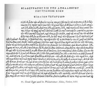
The adoption of an imitation of a cursive hand by Aldus for his new fonts is not wholly explicable by the wish for a compact type. His italic types were only a development of an idea already put into effect in his Greek fonts. The older Greek manuscripts employed formal, simple characters, separate from each other and with comparatively few ligatures or contractions, which adapted them very well to translation into type;2 but Aldus preferred to imitate the cursive Greek handwriting of his time, which was filled with an immense number of ligatures, contractions, and unnecessary complications.1 Despite their faults, these cursive Greek fonts hit the popular taste. So when a small, compact type was wanted for editions of Latin classics, etc., I suppose it may have seemed to Aldus natural and clever, to do for Latin letter-forms what he had done for old Greek letter-forms. It may be, too, that Aldus adopted a cursive letter for his new font because it suggested the popular and informal character of his projected series. Whatever his reasons, the result was the Aldine italic.
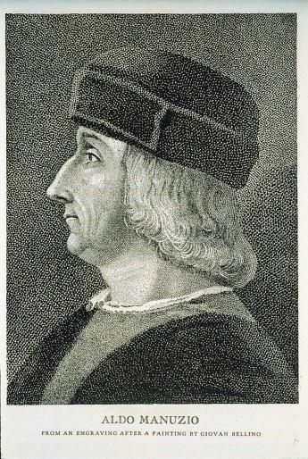
The punches for these types were cut by Francesco da Bologna (whose name was Griffi, and is not to be confused with II Francia), who had already designed roman types for Aldus. Tradition says that he intended to imitate the handwriting of Petrarch2 — too picturesque a fib to give up, though comparison with specimens of Petrarch’s handwriting upsets the theory. The high-flung names of Aldus Manutius, Francesco da Bologna, and Petrarch have dazzled us into forgetting that the production of these little books printed in italic was a simple business affair. If Aldus had been named “Brown,” Da Bologna “Smith,” and Petrarch “Jones,” the venture would appear to us more what it appeared to the Venetians of that day. The first books printed in the new font were the Virgil and Juvenal of 1501.
The Aldine italic was founded upon a Humanistic cursive Italian handwriting of a somewhat earlier period, of which there are endless examples.1 As a type it had several particularly distinguishing features: first, originality of character; second, a large number of tied letters, of which there are about sixty-five in the Aldine Dante and Virgil; and third, the use of roman capitals shorter than the ascending lower-case italic letters - indeed, the dot of the lower-case i stands above a roman capital I. In pages of Dante’s Purgatorio, the capital belonging to the first word of the first line of each three-line stanza is set off from the rest of the word, following in this Italian manuscripts of the period. Tied letters were used to produce a cursive appearance. For these tied letters an elaborate case was necessary, and thus composition became much more difficult; but in the later Aldine editions fewer tied letters were used, without great loss of effect. Aldus employed his italic as a text type for an entire book. It was a character entirely independent of roman. Placing italic fonts on bodies corresponding to roman fonts was the outcome of its later use in connection with roman for purposes of differentiation, emphasis, and for “liminary and preliminary” matter.
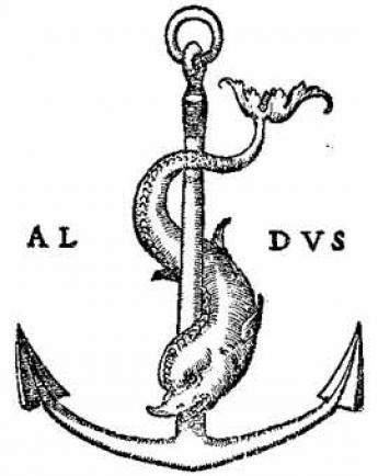
This Aldine character became the model for most subsequent italic types. In its own day it had a great success, and, like most typographic successes to-day, was widely and inaccurately imitated; but although the Venetian Senate gave Aldus an exclusive right to use the character, a patent confirmed by three successive Popes, counterfeiting went on. The Italians called the character Aldino. By others it was called Italic, either because they did not care to give Aldus so obviously the credit for inventing it, or did not wish to appear to have stolen it from anybody in particular!
A rival printer, for whom Griffi made another set of punches, published Aldus’s own edition of Virgil in this type, so that his literary text as well as his type was pirated. This same edition of Virgil was reproduced at Lyons, with a counterfeit Aldine device upon it. Aldus issued a printed protest, and pointed out mistakes made by the Lyons printer in his reprint. This document was at once used in producing a new and more correct Lyons edition. Several series of these Aldine counterfeits appeared in Lyons, of all degrees of imperfection; the worst, perhaps, being produced by a sort of Jack-of-all-trades named Bartholomew Trott, who in these volumes described himself (as no one else was likely to do) as “the honest book-seller.” The Giunti of Florence also copied the Aldine editions.
To the Lyons printers we owe the slanting italic capital letters now adopted for all italic fonts. Artistically this was not wholly an improvement, as roman capital letters gave a page of italic lower-case type an agreeable perpendicular movement which italic capitals do not supply. So what was generally considered a fault in the Aldine italic was, typographically, one of the best things about it. The Aldine printing-house, however, itself adopted italic capitals about 1560, some fifty years after the death of Aldus. Six different sizes of its italic type had meanwhile appeared.
The Aldine italic is often spoken of as an admirable invention, and from certain literary points of view, it may have been. But italic became a workable type for the printer only when precisely that characteristic was discarded which made it most Aldine, i.e., imitation of a cursive hand. Though the character on which Aldus based his italic was more quickly written than the older book-hands, it was far slower to set up as he rendered it in type: and it certainly was foolish to try to imitate written characters by type, when by so doing much useless labour was necessitated. It was not that Aldus did not know about old Greek or the best current Humanistic manuscripts; but he did not think his problem out. He appears to have been seduced by the amusing trickery of reproducing current handwriting by type; and that is the reason that in his italic, and still more in his Greek fonts, he was about nine times too clever!
With the Aldine italic, originality of idea in type-forms ceases. The civilité introduced by Granjon at Lyons a few years later was very different in form from italic type, but the idea was the same—it was a type based on a cursive handwriting used in a particular class of documents and of a certain period and locality. The script shown by type- founders now is our version of such types as the Aldine italic and civilité. It is supposed to imitate our best handwriting, though usually it reproduces the impossibly perfect letters of a writing-book, which if children followed absolutely and persistently we should invoke the aid of the rod!
Of every class of type there are many forms, but one or two forms only that are the best. We can learn what these best forms are by knowing what early handwriting and early type was, and what early printers meant to do. Only when we understand their problem can we justly judge how well they solved it. To see what the manuscripts were that they tried to reproduce in type is a step to this knowledge; to see how forms produced by a pen were changed when rendered in metal is another. A third step is the realization of the influence of history, nationality, scholarship, and custom upon type-forms. We must also have a comprehension of the evolution of economic problems - how cheaper books were demanded, how that want was met, and what its effect was on types and their use. The ability to recognize all this can be arrived at only by that historical perspective and that training of the eye which is gained by study and observation.
And, too, by examining early types with all these factors in mind, we can finally arrive at some approximation of a canon of taste in types. No person or group of persons can be so opinionated as to assert that their conclusions represent learning and taste, or expect them to be so considered. But any one may arrive at sound conclusions as to types, if he knows thoroughly the history of type-forms, has an eye sensitive to their variations, and has familiarized himself with the ways in which they have been employed by masters of typography.
Fifteenth century types are the classics of type history. We can know very little about the best types if we are not familiar with them. But types of this class can be used only in accordance with certain conventions that often unfit them for the work of to-day. It is for this reason that we must glean from types used in different countries in the sixteenth, seventeenth, and eighteenth centuries, a knowledge of those more modern typographical forms which, in a minor way, are also classic, and yet more related to the printing we have to do. A man may admit that Horace and Virgil are classics, and yet feel the need of other books in his library. So it is with type-forms. We cannot always use “classical” types, but we can always use good types. While it may be necessary at times to choose types for printing the Æneid, it is quite as important to know what types to select for the kinds of books we print so much oftener nowadays. To this end we must make some study of the best fonts in use in various countries from the end of the fifteenth to the beginning of the nineteenth century.
1“We think of the cheap book and the public library as blessing coming direct from the invention of the printing-press, and at first thought we may be inclined to suppose that in Rome, when copies had to be written by hand, books must have been as dear as they were during the Middle Ages…. This was not the case. Copyists had been trained to attain such a speed in writing, and slave labor was so cheap, that in the first century of our era, as Martial tells us, the first book of his poems, which contains about seven hundred lines, could be had at a sum amounting to thirty or forty cents, while his Xenia could be sold for twenty cents. At these rates, books did not cost more than twice what they do to-day.” Abbott’s Society and Politics in Ancient Rome. New York, 1909.
2 Like the Greek font used in the Complutensian Polyglot (fig. 228).
1 For some of the contractions supplied by ligatured Greek letters, see Savage’s Dictionary of the Art of Printing, pp. 300–302. While simplifications of Greek type took place in France under the Estiennes, and still more changes have been made since, the original misunderstanding has never been corrected.
2 Probably based on a misconception of the phrase, tolto con sommissima diligenza dallo scritto di mano medesima del Poeta, occuring in the colophon of the 1501 Aldine edition of Petrarch’s Cose Volgari. This means merely that the text of the edition has been carefully transcribed from a manuscript in Petrarch’s autograph. The statement is twice repeated, in varying phrase but with identical meaning, in the address entitled Aldo a gli Lettori.
1Paléographie Latine, pl. 116a — Brief of Sixtus IV, 1472.
Excerpt from Daniel Berkeley Updike, Printing Types, Their History, Forms and Use. Oak Knoll Press 2001. The text is presented here by permission of Bob Fleck (Oak Knoll Press). Thank you very much.