The Art of American Book Cover - When did we leave the Victorian era?
By Richard Minsky
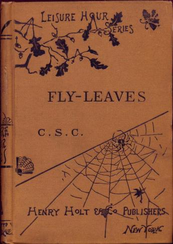
This binding was recognized early on as an important departure from existing cover designs. In the landmark 1894 exhibition "Commercial Bookbindings" at The Grolier Club, this book was chosen as:
...an excellent example of the beginnings from which came the modern commercial cover of the first class. This is the “linen-duster” cover in which Messrs. Henry Holt & Co. bound their Leisure Hour series. The cloth is light drab linen, cool and inviting as a hammock, and is stamped in black, the title enclosed in a single border line, with a cobweb and a leisurely spider in the lower right-hand corner. This book was published in 1872, and since then the art of designing ornamental covers has flourished like a bay-tree; yet it is doubtful if any more popular cover has been made. It seems exactly suited to its use.
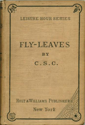
This design was kept for several years, and was replaced by a variant in mustard cloth that showed a greater oriental influence.
(Picture: Fly-Leaves, by C. S. C. (Charles Stuart Calverley). New York: Holt and Williams, 1872. 17 x 11.5 cm.)
The 1872 spider web design morphed into this version. Here we see a tree branch and more asymmetrical design, both characteristics of Japanese art that become common elements in American binding design. This became the uniform cover for Holt’s Leisure Hour Series, which included many titles, at least through Turgenev’s Annals of a Sportsman (1885).
This book is dated 1872 on the title page. The first “Leisure Hour Series” edition of this book (1872) had the other cover. The Publishers Note (between title page and contents) indicates this (third) edition is January 1873. The endpaper ads include the “Recent Leisure Hour Volumes” in the back, among which is Stevenson’s New Arabian Nights, which was issued in 1882.
This points out a difficulty in dating cover designs. If it were not for the endpaper ads, we wouldn’t be able to place this copy later than January, 1873. We don’t yet know if there was an 1873 issue that had this cover. I have seen an 1875 “Leisure Hour Series” title with the earlier cover, so this design is likely later than that. It may in fact have first been issued in 1883.
(Picture: Fly-Leaves, by C. S. C. (Charles Stuart Calverley). 3rd Edition; with a New Poem. New York: Henry Holt, 1872 (but actually 1882, see below). 16.9 x 12)
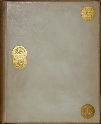
We can look further back to see book covers with the spatial relationships of Modernism in the British Arts and Crafts movement, and the Aesthetic movement, both of which developed from the Pre-Raphaelites. An iconic design that connects these movements was published in Boston by Houghton, Osgood in 1878 on Bayard Taylor’sPrince Deukalion. The design is by Dante Gabriel Rossetti, and was first issued in London on Swinburne’s Atalanta in Calydon (Edward Moxon & Co., 1865).
The cover looks like vellum over beveled boards, but is in fact cloth. The author was a friend of Swinburne, and also of Samuel Bancroft, Jr., owner of Bancroft Mills in Wilmington, DE, manufacturer of the vellum cloth for the cover of this book. Taylor was also a diplomat. He died in Berlin shortly after his appointment as the United States Minister to Germany, just a few weeks after this book was published.
The Rossetti design, with its simple adaptation of Japanese emblems, was then an anomaly in American publishing. What made it important was its influence on a young artist who began designing book covers a few years later.
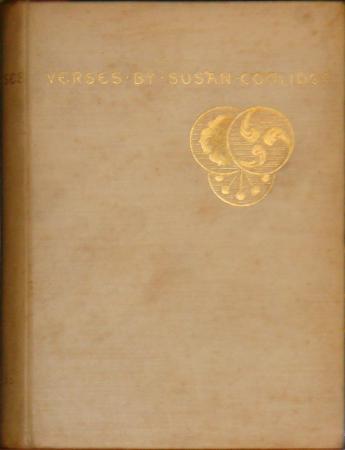
Sarah Wyman Whitman was a gifted painter who was also a prominent hostess to Boston culture, married to a prosperous wool merchant. She was a student of the painter William Morris Hunt, and also studied in France with Hunt’s teacher, Thomas Couture. She met Couture and Hunt’s earlier student, the multi-talented American painter and illustrator John La Farge, who was responsible for the revival of stained glass in America, and apprenticed with him. Hunt had also studied with Millet, and brought the influence of the Barbizon School to La Farge and Whitman.
The earliest example of her book cover design is on Verses by Susan Coolidge, published in Boston by Roberts Brothers in 1880. Whitman adapted Rossetti’s concept of stylized Japanese medallions, creating what might be the first American "Aesthetic" binding.
***
ILAB is proud to present a series of most interesting articles originally published on Richard Minsky’s blog The Art of American Book Covers.
Richard Minsky has been making and remaking artists’ books for over fifty years. His tremendous work is documented in The Book Art of Richard Minsky, published by George Braziller Inc. in 2011. Richard Minsky founded the Center for Book Arts in 1974. His work has been shown around the world and remains in public collections, including the National Gallery of Art and The Victoria and Albert Museum. He has received many fellowships, grants and awards of recognition, including several from the National Endowment for the Arts.
Text and images Copyright © 2019 Richard Minsky. All rights reserved. Used with permission.