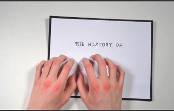
Ben Barrett-Forrest: The History of Typography, in Stop-Motion Animation

“Let’s face it, fonts and typefaces have officially become a mainstream obsession. In our current design-centric culture, terms like sans-serif, Helvetica, and — heaven forbid — Comic Sans have breached the cultural consciousness. Fortunately, for those of you who still can’t tell your Futura from your Papyrus, Yukon-based designer Ben Barrett-Forrest has crafted this charming stop-motion history lesson to help you get up to speed.
Built with 2454 photographs, 291 letters, and 140 hours of his life, Barrett-Forrest’s animated short is a delight. As he guides us from the lowly beginnings of Guttenberg’s printing press, all the way to the computer age, it becomes apparent that the art of type is a corollary for history.
Like architecture and fashion, typography is a reflection of the world in which it’s created. Barrett-Forrest explains his interest in type and the genesis of the project in an interview below.”
The History of Typography, in Stop-Motion Animation
>>> Watch the video by Ben Barrett-Forrest
>>> Read the full interview with Ben Barrett-Forrest in The Atlantic
