Maps and the 20th Century : Drawing the Line
By Laurence Worms - Ash Rare Books
For some reason, I didn’t get my customary invitation to the press preview of the latest British Library exhibition, “Maps and the 20th Century : Drawing the Line”, when it opened towards the last year – perhaps it was something I said. No matter, it’s still on for another six weeks or so – and I finally found some time to visit it a few days ago.
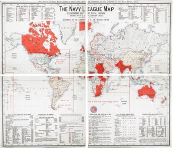
I found it challenging, which is a good thing. Challenging in terms of confronting our immediate past – and indeed our present. And challenging in terms of confronting my own mindset. The exhibition opens cutely with a real time digital map plotting the pattern and density of people touring the exhibition itself, which opens up a whole range of ideas on mapping, surveillance and the centrality of our own experience in judging the world. It’s certainly a more complex and less assured world than that pictured in the next map, the “Navy League” map of the world published in 1901 and “dedicated to the children of the British Empire”, a map of which the Earl of Meath could complacently state that “No school should be considered properly equipped which has not the full-sized Navy League Wall Map of the Empire hanging on the walls within easy view of the scholars” (cited in Tim Bryars’ excellent essay in the book of the same name which accompanies the exhibition).
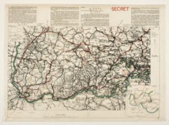
The section of the exhibition devoted to the theme of “Mapping War” is the hardest hitting. A salutary reminder of what a blood-stained mess most of the twentieth century was and the twenty-first continues to be. The section of a map of Belfast cut to fit a rifle-butt and the plan of the Lidice Massacre are truly chilling. So, in a different way, is the highly detailed Soviet map of that well-known hub of the industrial and military complex otherwise known as the seaside resort of Brighton.
I am not at all sure that I go along with one of the basic premises of the exhibition: that the all-pervasiveness of maps in the twentieth century meant, as one of the captions has it, that maps became “more real to people than the reality they claimed to represent”. Maps are treated here, a position perhaps made more explicit in the book than the exhibition itself, as if they are, and always have been, in the vanguard of the fake news and post-truth business – that all workaday maps, not just those made for more or less explicit propaganda purposes, lay claim to a scientific objectivity but in fact represent an illusion and are merely “tools of persuasion”.
It’s been a view fashionable among certain historians of cartography for the last thirty years or so, probably expressed at its most extreme by the late Brian Harley: “Cartography deploys its vocabulary accordingly so that it embodies a systematic social inequality. The distinctions of class and power are engineered, reified and legitimated in the map by means of cartographic signs. The rule seems to be ‘the more powerful, the more prominent’. To those who have strength in the world shall be added strength in the map. Using all the tricks of the cartographic trade—size of symbol, thickness of line, height of lettering, hatching and shading, the addition of color—we can trace this reinforcing tendency in innumerable European maps” (J. B. Harley, Deconstructing the Map. Cartographica, v. 26, n. 2 (Spring 1989), 1-20).
It is of course true that maps, for reasons of scale, are of necessity highly selective in their choice of detail – and that the process of selection may be compromised in any one of a number of ways. (This is of course also true of the selection or non-selection of maps to be displayed in an exhibition). Another caption reminds us, quite rightly, that properly to comprehend a map (or an exhibition) we need to understand why it was drawn in the first place – a lesson, it seemed to me, that was not being given nearly enough emphasis to the groups of schoolchildren being routinely indoctrinated as I made my way round. But I have always firmly rejected the view that the maps we use for our everyday ordinary purposes are devices to deceive or oppress us. That view seems to me to be nonsense and in itself a form of deceit.
But I have to admit the exhibition made me confront an uncomfortable truth. There is far more deceit in maps and there are far more maps intended to deceive than I was prepared for. I had always rather dismissed the propaganda map as something that shouldn’t really fool anyone with half a brain. People are nowhere near as stupid as some would have us believe. But examples to prove me wrong were there. I particularly liked the genuinely funny caricature map of the Reaganite view of the world put out by the World Peace Council – in fact a Cominform-funded Communist front organisation operating out of Helsinki. But the cleverest and patently the most successful in the long run, not least in having been paid for by the people it was intended to gull, was the “Europe in Britain” propaganda map of the British Isles (here very cautiously captioned), put out by the European Community in the 1970s. I’m still chuckling over that one.
As our use of maps dwindles to the personalised bubbles of Sat-Nav and App, perfect realisations of the “All About Me” syndrome, go to the exhibition and look back at the last century when we still saw and found reflected a world view that was mainly about others and our own very small place in it – maps both honest and dishonest – but all made for a larger purpose. As “The Guardian” rightly reported, “There is much that will stop visitors in their tracks”.
Pictures: The Bookhunter on Safari.
The exhibition still runs until 1 March 2017 and should not be missed.
More information